Snowfinch Group Pvt Ltd

Cross platform design

Seamless Cross-Platform Design That Delights Users Everywhere

At , we craft cross-platform designs that provide a consistent, intuitive, and engaging user experience across all devices. Whether it’s mobile, tablet, or desktop, our designs are responsive, adaptive, and optimized to maintain brand integrity while enhancing usability. Our goal is to help businesses deliver a unified experience that drives user engagement and conversions, regardless of the platform.

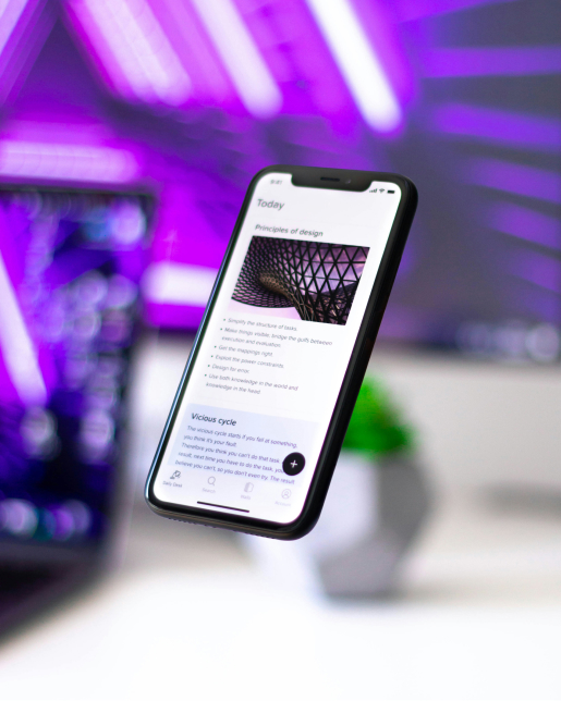
Cross-Platform UI/UX Design

Our ensures that users enjoy an effortless experience across all platforms. We focus on creating interfaces that are visually appealing, intuitive, and user-centric. By blending aesthetic design with functional performance, we enhance user satisfaction while aligning with your business goals.

Cross-Platform Design Experience

We prioritize designing experiences that feel natural on any device. Our team emphasizes consistency, accessibility, and interaction patterns that resonate with your audience. From gestures on mobile to navigation on desktop, every interaction is carefully crafted to feel seamless and engaging.

Cross-Platform Design for Web

Our web designs are responsive, scalable, and built to perform across browsers and devices. Using the latest technologies and design frameworks, we ensure that your website delivers fast, smooth, and interactive experiences that captivate users and improve conversion rates.

Cross-platform UI/UX Design

Cross-platform Design experience

Cross-platform Design for web

Our Advanced Cross-Platform Design Process

We start by understanding your business objectives, target audience, and user needs. This stage ensures that our design solutions align perfectly with your goals, and we identify the key features that will drive engagement and conversion.

Our research phase dives deep into industry trends, competitor analysis, and user behavior. By gathering actionable insights, we ensure that your design strategy is data-driven, innovative, and tailored to meet user expectations.

Wireframes allow us to map out the structure and layout of your product. We focus on user flow, content hierarchy, and interaction patterns to create a blueprint that guides the design process efficiently.

We develop interactive prototypes that simulate real-world usage. This helps stakeholders visualize the design, test usability, and make informed decisions before final development, saving time and reducing costs.

Our design team translates wireframes and prototypes into polished, visually appealing interfaces. We combine aesthetics with functionality, ensuring your platform is both beautiful and user-friendly across all devices.

We conduct rigorous testing for usability, performance, and responsiveness. By identifying potential issues early, we ensure that the final product delivers a flawless experience, no matter the device or platform.

Frequently Asked Questions (FAQs)

We use a combination of design systems, reusable components, and strict adherence to brand guidelines. This ensures that every element, from colors and typography to interactions, remains consistent across mobile, web, and tablet platforms.

Unlike standard responsive design, our approach considers platform-specific interactions, accessibility, and performance optimization. We deliver experiences that feel native while maintaining brand consistency.

We integrate lightweight frameworks, optimize assets, and conduct thorough performance testing. This ensures fast load times, smooth transitions, and minimal latency on any device.

Yes. Our team evaluates your current design, identifies gaps in responsiveness and usability, and transforms it into a cohesive cross-platform experience without compromising brand identity.

consult with our experts & start today

Get in Touch